Thursday, 25 October 2012

Deconstruction Analysis of Digipaks

Deconstruction Analysis

There are several generic conventions I have found from deconstructing existing digipaks. I deconstructed "Mumford and Sons - Babel", "Coldplay -Mylo Xyloto" and "Arctic Monkeys - Favourite Worst Nightmare".

    All of the digipaks had a clear house style. For example, Coldplays digipak had the same style graffiti pattern running through the whole digipak and similar colours throughout reinforcing the house style. The clear house style on all the digipaks I have seen, from online to real life examples have a house style. This means my digipak needs to have a house style to fit in with generic conventions. A house style also attracts the audience to a digipak because it is a style they like and recognise. My house style needs to be attractive and appropriate for my audience to encourage them to buy the digipak.
  
    On the front of the digipak, the band/artist name and album name were featured. The style of the presentation of the band/artist name and album name varied widely from position to font style and colour because of the changing house styles from digipak to digipak.  Coldplays album subverted these conventions. Only the album name was featured on the front cover of the digipak. This may be because Coldplay are a very established band and they're album name is very unique so wouldn't be mixed up with another band's digipak. The font style and colour of the band/artist name and album name are repeated on the spine of the digipak to help enforce the house style. 

    On the spine and generally on the back of a digipak is a symbol representing what record label the band/artist is signed to. I have discovered this is a generic convention. Therefore, before I start making my digipak, I need to research different record labels and decide which one would be best for my artist so I can use their symbol on my digipak to make my work look as realistic and professional as possible. 

   On the back of the digipak, the tracks for the album are displayed which is a generic convention. The layout of these vary due to varying house styles. The tracks are always listed in the order they are played on the album. Therefore, I can experiment with the layout of my tracks and the font to keep with my house style, but my tracks need to be kept in order to fit with generic conventions.

    The CD is never just a CD I have found on the digipaks I have deconstructed. The CDs are part of the artwork of the digipak. They are decorated in a style which fits in and compliments the house style. This has shown me that I need to consider my CD design aswell as my digipak artwork to have a fully designed digipak.

    Before I started deconstructing digipaks, I thought that a generic convention would be that the band/artist would be featured on the front of the digipak. However, I have found that this is not always the case within the indie genre. Two of the digipaks I have constructed, Coldplay and Arctic Monkeys, had no images of members of the band on their digipaks. Other digipaks I have looked at in the indie genre also have a lack of images of the band/artist. This shows me that I do not have to follow the convention of having a image of a person on the front of my digipak to attract the indie target audience. After some more research, I found that in the pop genre there was a stronger generic convention of having images of the artist/band on the front of the digipak. This suggests that the importance of this convention varies from genre to genre.

    The album name normally is one of the songs on the album. For example, the Mumford and Sons digipak I deconstructed; Babel was the first track on the album. This suggests to me that my album name has to be on eof the songs on my album to keep to generic conventions. This could be Glue which is the song I have used for my music video, or it could be another song I would display on the track list at the back of my album.

All of these generic conventions I have found I will consider and use in my work to make my digipak look as realistic as possible so if it did enter the market it would sell well making my artisr successful.

I have also looked at different templates and layouts of digipaks. The digipaks I deconstructed all had a simple layout which folded out. This is why I decided to look at different layouts of digipaks. From researching these, It has given me many different ideas about what template I could use to make my digipak to make it unqiue and stand out in the busy music industry market. 


Wednesday, 24 October 2012

Different Digipak Template Research

Digipak Designs

The digipaks I have deconstructed have a basic digipak design. You have a front which opens out to reveal a CD. From examples I have seen, there are many amazing, out of the ordinary designs ha a digipak exists.


This digipak belongs to the band "Foreinger" for the album 'Lowdown and Dirty'. At the time of release, the main method of playing music was to use a CD player. Therefore, they're digipak cleverly resembled a CD player that the audience would be able to recognise. The CD of the digipak is tucked away and protected by the CD player and case. The album name can be seen printed in a recognisable style of font where a real CD player would display the band/song name. The use of the music playing product to form a digipak makes it attractive to the target audience and makes it stand out against other digipaks or dualboxes.


This digipak is by "Zoviet-France" and the album is called "Just an Illusion". This digipak has the appearance of a sealed box.  When closed, the wooden box has a abstract pattern in a darker brown colour which almost looks like it has been wood burned. The Box opens up to reveal a paper case which has the CD inside. This wooden box completely protects the CD. It also makes the album feel special to the audience as they can lock it up and keep it safe.


This digipak for the album "Stress" by the band "Stress". This is a example of a ordinary digipak style. It has a front cover which folds out into several sections to reveal the CD at the centre. The centre of the digipak has several images of the band, all of which link to the house style.


This digipak is for the artist "Francesca Beghé" for the album called "Francesca Beghé". This is another example of a generic digipak. This one simply opens up to reveal a booklet and then the CD. A house style can clearly be seen in this digipak once again representing how important a house style is for a digipak.


 This digipak is for the band "Whitesnake" for their album called "Slip of the Tongue". The digipak itself has been wrapped up inside a layer of cardboard which appears to have been sealed by a ribbon. Inside this packaging is the actual digipak which has a large red wax seal placed in the centre. I like this idea of the digipak being wrapped up inside so it has the connotations of it being a present to the audience buying it.


This digipak by the band "Sting" for the album " The soul cages" is similar to "White Snake" album above. The CD has been wrapped up in a hessian digipak. This folds together and is wrapped up with hessian rope. The hessian has been decorated to create a house style, with calligraphy style writing printed onto the material. I like how the digipak  folds up to create a package which the audience can then unfold like it is a present to them. However, the hessian material the CD is wrapped in does not seem to provide much protection for the CD which could lead to it being broken.


This digipak is for the artist "Julia Fordham" for the album "Manhattan Skyline". It has a very classic house style. The digipack is fastened by a red ribbon which  runs through the digipak. The digipak opens out to reveal a flap in the centre which has a cut out skyline representing Manhattan. behind this is a red case which contains the CD. The red case helps to hightlight the cut out outline in the flap of the digipak making it stand out. The digipak has a clear house style using the colours red and white.


All of these different templates for digipaks I have viewed have given me many different ideas for what design I would like my digipak to be. It has also opened my eyes to how a digipak does not just have to be something that opens up but can be any design or shape.

Tuesday, 23 October 2012

Arctic Monkeys - Favourite Worst Nightmare Digipak Deconstruction.

Arctic Monkeys - Favourite Worst Nightmare.  

'Favourite Worst Nightmare' is the second studio album to be released by the British Band Arctic Monkeys. Arctic Monkeys are a indie genre band. The album was released in April 2007 having been recorded in London. The album went straight in at number 1 in the United Kingdom album charts while all of the twelve tracks from the album entered the top 200 of the UK singles chart. The album has since gone 2X platinum in the UK and it was nominated for a Mercury prize in 2007. At the 2008 Brit awards, it won Best British Album. The success of this British indie band, highlighted by the awards it has been nominated for and won,  is why I am deconstructing their digipak.  


Above is a deconstruction of the front cover of the digipak and then below it the folded out digipak. The rest of the outside of the digipak follows the same house style as the front cover. The back cover is plain with the songs on the album listed in a linear order keeping to conventions. They are in the same dirty sage green colour as the band name and album name on the front cover and also on the spine of the digipak. This helps to enforce the house style. The plain black background fits in with the house style. It has the connotations of the darkness of a nightmare linking with the album name which is why it works. Unconventionally, the back of the digipak does not have a section about copyright. Instead, the small text at the bottom highlights the record labels address and website along with the bands website. This gives the audience clear links about how they can find out more information about the band.   The section on the right is the inside flap of the digipak protecting the CD. This is another house on the terrace in a long shot. The house has been shot so it is a straight on image unlike the slanted houses on the front of the digipak. The pattern inside the windows has been continued from the front cover reinforcing the house style.


Above is a deconstruction of one of the inside sections of the digipak. Below is the folded out version of the digipak with the image on the right being the one I deconstructed. The image on the right is very similar to the one I deconstructed.. It is a different window in the house seen at the front of the digipak and displays a different pattern but still with the same set of colours enforcing the house style. At the centre of the digipak is the CD.  The image on the CD is a animated version of a mans face possibly representing the male members of the band. The man is wearing checkered glasses which are flaming to continue the connotations of a dream/nightmare.


I searched for references to the digipak in the music videos the band have produced for this album, "Favourite Worst Nightmare".  I found a lack of references, just like with the Mumford and Sons album, to the digipak artwork. This means the audience will not be able to relate the digipak to other mediums of media. Since the band Arctic Monkeys had a very strong debut album which made them well known to a wide variety of audiences, this may not be that important to help sell the band.


Thursday, 18 October 2012

Post Production - Viewing of my music video

As part of the post production process of my music video, I need to research where my music video will be shown or watched by members of my target audience and other audiences too.

Youtube
YouTube is a video sharing website which was created in February 2005.  Individuals upload videos onto the website which can be watched by other people. As the video sharing website became popular, larger companies started offering material on the site. Youtube has also become a advertising centre. Adverts can be seen before videos are viewed. In November 2006, YouTube was brought by google for the price of $1.65 billion.
Many artists now use YouTube as the main viewing platform for members of their target audience to view their music videos. Official music videos are uploaded by  the bands official page on YouTube which is partly run by the record company they belong too. On YouTube, many unknown bands have made their way to the top by uploading their music and music videos. The song I am using for my artist: "Glue by Nina Nesbitt" has a total of 100,513 views. She is still a relatively new artist with only 1 EP album released. The large amount of views ammounted for this one song suggests that YouTube and easy access to her music has boosted her credibility and popularity as a artist.

I am planning to place my video on Youtube. If I was going to release my track officially into the music market then I would be placing the video on YouTube to gain followers. Instead, I am going to place the video on YouTube to gain valuable feedback from members of my potential target audience.

iTunes
iTunes is one of the biggest online music download sites available. it is run by apple who launched the store to link up with their music playing products such as the ipod nano and the ipod classic. iTunes has recently started offering a new feature; the ability to buy music videos. If I were to release my music video I would consider getting it available to buy on the Apple iTunes store so my target audience do have the opportunity to buy the music video along with the song if they so wish.

Music Channels
In the modern technological age, the most popular viewing platform for music videos is online. This is the same for my target audience. In my generic music questionnaire, 90% of my target audience said they viewed music videos online. However, if I could have my music video shown on music channels on the TV, it could gain more popularity for both my artist and the video. There are several Music Channels shown on TV in the UK.

4Music
4Music is a music channel available to everybody in the UK since the digital switchover. They mainly focus on whatever music is in the charts and in popular demand. This means they cover a wide variety of genres but mainly focus on R&B, Hip-Hop and pop genres as these are the ones which are currently most popular in the UK. However, from my own personal viewing habits, I know that they sometimes do feature indie genre programmes which play several different songs from the indie genre over a period of 1 to 3 hours. Therefore, There is a possibility that 4Music would be a suitable music channel for my music video to be viewed on. But, there may be a better music channel which focuses purely on the Indie Genre which would be better for advertising my music video and artist.

Viva
Viva is a music video and entertainment channel available to everybody in the UK since the digital switchover. It was launched in 26th of October 2009 replacing another music channel; TMF. The genres viva represents are very similar to the ones which 4 music represents; pop, R7B and whatever is current in the music charts of the UK.
Viva tends to have music video programmes during the day time and has now expanded into showing entertainment programmes such as the Fresh Prince of Bel air and South Park in the evenings. They are no longer a completely dedicated music channel which is why I would not like my Music Video to be shown on the music channel.

MTV
MTV has a total of 11 different music channels which can be accessed on Sky and other equivalent
digital packages. There is MTV's main channel which focuses on a wide variety of genres with this channel having a +1 channel and a HD channel. There also separate MTV music channels which focus on certain genres. These range from classical to live music.
My music video would fit in well on the channel MTV music which plays a variety of music. It would also fit on their flagship channel of MTV. MTV is a large company with music channels and also music magazines all run by the parent company of Viacom International Media Networks Europe. If i were to use MTV as a channel to have my music video shown, It could also mean I would be more likely to have my new album advertised in one of the MTV magazines.
One of the limitations however of having MTV as a viewing platform for my music video is that MTV is only available on certain digital boxes and therefore not available for everybody to view meaning some of my audiences may miss out.


SCUZZ and Kerrang!
These are two different music channels belonging to different companies. They are some of the most popular music channels and like MTV are only found on certain digital boxes. I know, despite the popularity of the two channels, that my music video would not be suitable. This is because these two channels represent the rock and metal genres.


I know it is vital that I place my video up on YouTube for free. This is due to my audience feedback saying this is the way they use most to view music videos. It would be up there for free meaning my artist and any record company she would be signed too would not make any money. However, it would encourage audiences to listen to the music by Tempany and encourage them to purchase the music. I would also put the video up on iTunes for sale.

As for music channels, I believe that approaching both 4Music and MTV would be the best way to advance. By approaching both companies there is a possibility that my music video could be shown on both channels increasing the amount of people who could view the video. This also allows all members of the audience to view the video on 4Music as that channel is now available to everybody since the digital switchover. But it also my artist to make conections with the larger company of MTV which could prove helpful in the future.


Wednesday, 17 October 2012

Coldplay - Mylo Xyloto Digipak Deconstruction

Coldplay - Mylo Xyloto
Mylo Xyloto is the 5th album released by the British alternative rock/indie band Coldplay. It was released worldwide on the 24th October 2011 by the record company EMI which was recently brought out by Universal Music Group. It debuted number one on the album charts in both the UK and the USA. Coldplay are a very established band with a large worldwide audience. There album has been out for almost a year and is still selling strong. For these reasons, I have chosen to deconstruct their digipak.

Here is a quote from wikipedia describing the digipak artwork:
"The album's artworks were revealed on 12 August 2011, inspired on graffiti the band worked again with longtime collaborators Tappin Gofton and, this time, also with British street artist Paris. The band had already started to research and work with graffiti on their home studios, The Bakery and The Beehive, when designer Misty Buckley introduced Paris to them, as they were looking for a graffiti artist to teach them the techniques to do it. Although initially he was supposed to be just a "teacher", Paris stayed on the project until the end, producing part of the final work along with the band.

Coldplay wanted it to be an explosion of vivid colours as a counterpoint to the subdued colour palette of Viva La Vida, and at the same time there were lots of lyrics and codes they wished to add. Researches and development into street art started six months before the work had begun. Then a graffiti wall was painted by the band itself and Paris, formed by nine parts. Tappin Gofton wanted the whole evolution of the wall, so at the end of every day loads of super detailed photos would be taken from it. In the end a picture including three parts of the wall was featured on the front cover, while the whole wall is featured on the centre of the CD's booklet."


The image seen above is  the Inlay of the digipak where the CD would be located.  This image almost looks like a zoomed out version of the one displayed on the front of the digipak. However, once studied closely it is a different image but it has used elements from the front to help create a house style.  The copyright section is located centrally at the bottom of the image in white to help it stand out against the background and to fit in with the house style. To the left of the image the bands name and album name can faintly be seen. This attracts the audience as it provides another element they may not see on their first time of viewing the image giving them a sense of involvement when they do spot it. 

Above is the CD for the digipak. All of the colours which can be seen on the CD have been used in the rest of the digipak to help it fit in with the house style. This blend of colours is more relaxed than on the rest of the album. This may be because of the fact the CD is the most important part of the album, and the audience have now found it so therefore they can 'relax'. The CD is dominated by this black swirl that is coming out from the centre. This helps to make the CD look more dramatic and keeps it interesting for the audience. Displayed in the spiral is once again the copyright statement. This is the third time I have seen this statement on the digipak suggesting it is very important to the producers and distributors of the album. It is always in small text suggesting it is not that important for audiences.

"Paradise" is the third track on the "Mylo Xyloto" album. It was released as a single on the 12th of September 2011 for audiences to buy. Currently, the official music video on YouTube has 157,177,042 views highlighting its popularity. I have already looked at this music video for the lyric sequence which helped inspire my lyric sequences in my music video.
The reason I am looking at this music video is because there are elements within the video that fit in with the house style of the album.


This is a screen shot taken from the music video. The graffiti on the wall helps link in with the graffiti style art which is found on the digipak. Similar colours are also used on the digipak. This helps highlight how their are links between music videos and the digipak style.

In the end section of the 'Paradise' music video, there are shots from one of Coldplay's live performances. These fit in well with the narrative of the music video and help to engage members of the target audience and encourage them to go to their live performances by showing how spectacular they can be. Behind the lead singer in the image above, a large LED screen is displaying images which are in similar colours to those found in the digipak. This suggests the house style of the digipak extends to both to music videos of songs released and to their gigs to fans.


I then investigated other music videos that have been released alongside this album. There was little reference to the house style from the digipak in the music video: "Princess of China - Coldplay Ft. Rihanna". This may be because of the collaboration with the singer Rihanna so therefore Coldplay couldn't use just their elements in the music video. However, I did find the music video for the song "Every Tear Drop Is a Waterfall" has many references to the house style. I found this music video fascinating and very interesting to watch. They had used some of the animation techniques that I have learnt during my coursework such as pixelation.


At the beginning of the music video, the lyrics for the first verse are displayed as they are sung. Stop motion animation has been used to allow this. The use of these lyrics, in a grafiti style links to the lyrics which can be found around the digipak. The second image comes from a latr sequence in the music video. Coldplay are shown playingthe song in the dark with a neon background behind them which is full of words and symbols. There is a extreme close up of the word tear linking to the song name. Tear has been written in exactly the same font as the text on the digipak. This reinforces the idea that the house style of the digipak extends further than just the digipack itself.

Tuesday, 16 October 2012

Alterations While Editing

Alterations While Editing

In the editing process, the different shots of film I had taken completely changed. They were cut, modified and altered to fit my music video. Several of my ideas changed in the editing process. These ideas were to improve my music video and to make it look more realistic and attractive to target audiences.
I kept edit notes throughout the editing process which can be seen below. These edit notes are similar to notes which would be kept if any piece of filming were edited in the media world and released in real life. these edit notes helped me several times in the editing process where sometimes I had to delete sections which I had already edited to correct a sequence earlier in the video.
I tried to keep to my original shot list as much as possible. I used many of the techniques such as sepia colour editing to help reflect the narrative which I had planned to edit in the editing process. I edited the lighting a lot throughout my video to help it look more professional. However, there were sequences I changed and shots I added in. Details of these can be seen below.


My ideas that changed:

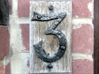
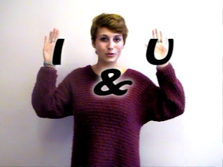
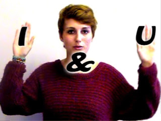
After completing a basic edit of my music video throughout, I felt that the beginning section of my music video was not strong enough for a introduction of a music video. The numbers my artist was holding were swaying in the wind and it did not look effective. I decided to replace these sections with pictures of different door numbers to keep with the lyrics: "One, Two", "Three, Four".  I still kept some of my original footage on her holding up numbers. The first shot we see of her is still a long, wide angle establishing shot to keep to conventions.


In some of my practise filming shots, I experimented with the hand movements and lettering needed for my first chorus. I experimented with colour in these shots and decided that the neutral colour of black worked best. However, when I started adding text to my real shots with my artist, because of her dark red jumper, the black words didn't stand out enough and were lost in the shot. I therefore, once again had to experiment with colour. I decided to add a white shadow to all of the words that appeared on screen. This made the text stand out without it over powering the shot. It also added an extra dimension to the shot and made it look wacky and weird attracting the target audience.


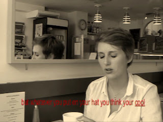
During the shots in the cafe location at the end of the second verse, I felt that these shots needed something extra to help bring the music video together and to make this section of the video more interesting. I was pleased with the shot composition and lighting so I didn't want to edit the colour or add any more effects than I had already done. I decided to experiment with the idea of text on the screen representing lyrics. By doing this I was linking it to earlier moments in the music video; the first chorus.  I added subtitles centrally at the bottom of the shot during the sections where my artist is singing. I underlined the lyrics she was currently singing to help the audience sing along and get involved within the music video. I experimented with the colour of the text. I started off trying black text and white text. However, both of these neutral colours did not stand out enough against the shot. I then tried using the same colours that i used in the first chorus, black with a white shadow to help the video have a overall style. This did make the text stand out but it also overpowered the shot in my opinion. I finally decided to use red text. The reason for my choice is that the shots after this sequence are the extreme close ups of red lips. By using red text it helped lead into this next section of the video and bring the music video together.


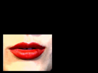
I originally wanted to use an editing technique that split the screen into four during the sequence where there is a extreme close up of red lips. I wanted to the screen to split to highlight the change of pace in the music. However, once arriving in the editing room, the programme we were using to edit, Pinnacle Studios, did not have this feature. I then decided to experiment using the editing technique picture in picture. This allowed me to have a smaller shot of red lips singing on a black background which then transitioned into the red lips singing in a different part of the screen. I think this worked more effectively than my original idea because I could edit on the beat highlighting the change of pace in the music much more effectively.


After editing the picture on picture sequence described above, I still wasn't happy with the close up of the red lips. I felt, even though I was proud of the shot, it continued for too long. This wasn't something I had planned for and I did not have any more other sequences of footage. To come over this problem, I decided to use a sequence I had already used within the music video, the first chorus. This was where my artist used her hands to bring lyrics up onto the screen. This was one of my favourite sequences in the whole video which is why I chose to use it again. I zoomed in on the shot and used the same colour correction and lighting editing techniques that I had used on the lips. This helped make this sequence look unique and fit in between the two lip sequences. I then added text, in the same font and colour as before, on top of the shot.


Wednesday, 10 October 2012

Costume

Costume

Costume is a important part of music videos as it can help represent a particular genre of music and can also help target a target audience.  I thought about costume before every shot taken in my music video and made sure what my artist was wearing on the day was relevent to the genre and to the audience.


This is what my arist was wearing for the first sequence of my music video. The style of clothing is on trend while also is popular with the indie fashion scene. The mac she is wearing is Jack Wills. This is not a 'indie brand'. However, it looks indie so fits with the shot. Other audiences may be attracted to the music video as they may like the brand Jack Wills and be able to identify with her clothing


For the first chorus, where she is 'bringing' lyrics up onto the screen, This is what my artist is wearing. This baggy jumper is a popular style trend at the current time with all potential audiences including my indie target audience. The dark red colour is effective because it adds some colour to the white blank background without over powering the shot or the lyrics that will appear on the screen.


This is her outfit for the shots taken for the second verse, in the house location. She is wearing a printed word vest top which is a very popular, common statement top which the target audience would wear. She is also wearing a beanie hat which is also a common indie trend.


This next shot was filmed at the same time as the above shot because it was the most effective use of time to film all the shots needed in one location at the same time. Therefore, to keep to the narrative of the previous shots being a flashback, i needed my artist to bring a change of clothes to make it look like the time has changed. Her beanie hat has been removed and her white top covered by her red jumper that was seen in previous shots. This re-use of clothing helps the target audience identify with her. She is also wearing red leggings creating a relaxed, stylish feel to her outfit. This is similar to what audiences may wear around their house helping them to relate to the video.


For the next set of shots she is wearing black leggings and a long white top. In recent years, the fashion of leggings has become a major trend with all target audiences. the monochrome look is also a big trend in autumn/winter 2012. All of these elements to her outfit help all audiences relate to my artist.


The shots I took in the cafe where I work were filmed on the same day as the shots at the back of Bishops Palace Gardens. Despite her wearing the same outfit as before, because the majority of shots are taken of her sitting down, it looks like she is wearing a different outfit. It is important to show the largest variety of outfits possible so her fashion helps represent both the audiences and the indie genre.


For the final shots she is wearing the white top and black legging combination but also with the blue Jack Wills mac. By wearing the mac on top of the clothes it once again looks like a different outfit. It also helps to wrap up the music video as she was wearing this coat at the beginning and now she is wearing it at the end creating a full circle.

Alterations While Filming

Alterations While Filming

Because of unforeseen circumstances, I had to make some changes from my original shotlist when filming my final shots.

I originally planned to buy 3D paper maché numbers for my artist to hold up in the first sequence of shots in the video. I searched the Internet and found these for sale cheaply in the Arts and Craft shops Hobbycraft. http://direct.hobbycraft.co.uk/shop/paper-mache_numbers. However, after visiting this shop twice and the munbers being out of stock both times, I decided instead to use printed numbers on a sheet of paper.
I wanted to use bognor beach as the location for the photo sequence of shot numbers 7A to 9A. However, this location was out the way for my actors and we had a hard time trying to arrange a time convientant for all parties where we could film this sequence. Eventually, because of time pressures this sequence was filmed in Chichester, behind Bishops Palace Gardens; the location I had used for other shots.This location was not as attractive  as my original plan but did add historical content to my video as in the background is Chichesters old roman wall. 

Now I have filmed all my shots, I can start the editing process. I am using the programme Pinnacle Studios to edit my music video together. This is a effective programme that I have used before. Editing is a long process that can take more time than filming. To keep track of my editing progress I am going to use a editing note table. This will include what shot I decide to use and any editing details such as a change of colour.

Mumford and Sons - Babel Digipak Deconstruction

I am using the site http://www.allcdcovers.com/ to find different indie genre digipaks to deconstruct. This site is very useful as it displays several different aspects of the digipack such as the front back, the inlay and CD. However not all of these sections are available for every digipak and every artist so it can be a hit and miss website.
Mumford & Sons - Babel
    Mumford & Sons are a successful British indie band whose singles make it into the top 40 on a regular base when they are released. The album I am using to deconstruct the digipak from is called Babel. It was released on the 24th of September 2012. It became the fastest selling album of 2012 in the United Kingdom selling over 150,000 copies in the first week of its release. Because of their popularity as a indie band who have extended their popularity across the world and to the USA, I am going to deconstruct their digipak.


    Above is the CD for the Mumford & Sons Babel album. The house style has been kept in the CD. The band name and album name are in the same font as they were on the spine and front cover of the digipak. The use of lines to create 'bricks' has been replicated on the CD from the back cover too. The use of white on all text and on the production/distribution symbols of the companies that helped to make this album are all in white once again keeping to the house style. At the bottom of the CD is the exact same copyright warning that was located on the back cover of the digipak. This is once again in small text because it is not of urgent importance the target audience read it but it does need to be there to protect the music and artwork of the album. The one thing that subverts the house style of this CD is the colour. The bright blue colour has not been featured in the rest of the digipak I have deconstructed making this CD stand out. One reason why it might stand out is because it is the most important part of any album. To discover is this is a generic convention, I am going to have to deconstruct more digipaks and CDs.


Above is the music video for the song: " I Will Wait" from the above album Babel. This is currently the only music video from the album Babel that has been released. However, generally more than one music video is released for the songs on the album. Since the album has just been released there is a large possibility that there will be more music videos released in the future. There is a generic convention that the digipak will relate to a music video by the artist/band. This is to help the target audience recognise all the different forms of advertising and link them back to the same band. This music video does not follow this convention. Instead it is a live performance of the band singing "I Will Wait". The band is still relatively new so therefore they might not need to follow the marketing conventions. However as they gain popularity, they may be marketed more as a brand.

Monday, 1 October 2012

Digipack Introduction

Digipak!

    While I am waiting for my filming to be completed so I can edit my final music video together, to make best use of my time, I am going to start my first subsidiary task of creating a digipak.

     This means creating my own digipak for my new artist. I will need to discover the generic conventions of digipaks within the indie genre so I can apply them to my digipak. There are several templates which digipaks come in. Some with a booklet, some without and some which fold out to create a shape. I will then have to decide which template is best fitting with my digipak and use it. The next step will be to plan what images I am going to take for my digipak. Test shots will be important to this step as i can then experiment with lighting and position of the camera. The last step will then be constructing my final digipak using the best images I have taken and uploading it online.