Alterations While Editing
In the editing process, the different shots of film I had taken completely changed. They were cut, modified and altered to fit my music video. Several of my ideas changed in the editing process. These ideas were to improve my music video and to make it look more realistic and attractive to target audiences.
I kept edit notes throughout the editing process which can be seen below. These edit notes are similar to notes which would be kept if any piece of filming were edited in the media world and released in real life. these edit notes helped me several times in the editing process where sometimes I had to delete sections which I had already edited to correct a sequence earlier in the video.
I kept edit notes throughout the editing process which can be seen below. These edit notes are similar to notes which would be kept if any piece of filming were edited in the media world and released in real life. these edit notes helped me several times in the editing process where sometimes I had to delete sections which I had already edited to correct a sequence earlier in the video.
I tried to keep to my original shot list as much as possible. I used many of the techniques such as sepia colour editing to help reflect the narrative which I had planned to edit in the editing process. I edited the lighting a lot throughout my video to help it look more professional. However, there were sequences I changed and shots I added in. Details of these can be seen below.
My ideas that changed:

After completing a basic edit of my music video throughout, I felt that the beginning section of my music video was not strong enough for a introduction of a music video. The numbers my artist was holding were swaying in the wind and it did not look effective. I decided to replace these sections with pictures of different door numbers to keep with the lyrics: "One, Two", "Three, Four". I still kept some of my original footage on her holding up numbers. The first shot we see of her is still a long, wide angle establishing shot to keep to conventions.
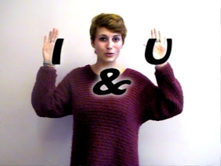 In some of my practise filming shots, I experimented with the hand movements and lettering needed for my first chorus. I experimented with colour in these shots and decided that the neutral colour of black worked best. However, when I started adding text to my real shots with my artist, because of her dark red jumper, the black words didn't stand out enough and were lost in the shot. I therefore, once again had to experiment with colour. I decided to add a white shadow to all of the words that appeared on screen. This made the text stand out without it over powering the shot. It also added an extra dimension to the shot and made it look wacky and weird attracting the target audience.
 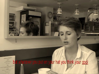 During the shots in the cafe location at the end of the second verse, I felt that these shots needed something extra to help bring the music video together and to make this section of the video more interesting. I was pleased with the shot composition and lighting so I didn't want to edit the colour or add any more effects than I had already done. I decided to experiment with the idea of text on the screen representing lyrics. By doing this I was linking it to earlier moments in the music video; the first chorus. I added subtitles centrally at the bottom of the shot during the sections where my artist is singing. I underlined the lyrics she was currently singing to help the audience sing along and get involved within the music video. I experimented with the colour of the text. I started off trying black text and white text. However, both of these neutral colours did not stand out enough against the shot. I then tried using the same colours that i used in the first chorus, black with a white shadow to help the video have a overall style. This did make the text stand out but it also overpowered the shot in my opinion. I finally decided to use red text. The reason for my choice is that the shots after this sequence are the extreme close ups of red lips. By using red text it helped lead into this next section of the video and bring the music video together.
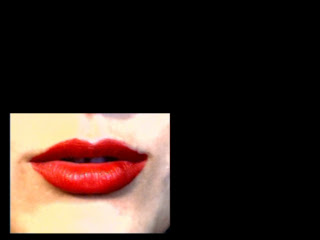 I originally wanted to use an editing technique that split the screen into four during the sequence where there is a extreme close up of red lips. I wanted to the screen to split to highlight the change of pace in the music. However, once arriving in the editing room, the programme we were using to edit, Pinnacle Studios, did not have this feature. I then decided to experiment using the editing technique picture in picture. This allowed me to have a smaller shot of red lips singing on a black background which then transitioned into the red lips singing in a different part of the screen. I think this worked more effectively than my original idea because I could edit on the beat highlighting the change of pace in the music much more effectively.
 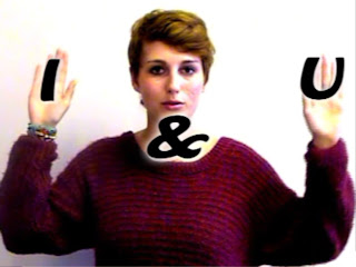 After editing the picture on picture sequence described above, I still wasn't happy with the close up of the red lips. I felt, even though I was proud of the shot, it continued for too long. This wasn't something I had planned for and I did not have any more other sequences of footage. To come over this problem, I decided to use a sequence I had already used within the music video, the first chorus. This was where my artist used her hands to bring lyrics up onto the screen. This was one of my favourite sequences in the whole video which is why I chose to use it again. I zoomed in on the shot and used the same colour correction and lighting editing techniques that I had used on the lips. This helped make this sequence look unique and fit in between the two lip sequences. I then added text, in the same font and colour as before, on top of the shot.


No comments:
Post a Comment