Tuesday 11 December 2012

Magazine Research

Now I have created my magazine advertisement, I need to decide where it would be placed in the media industry.

The Fly  (Magazine)

The Fly is a free music magazine published monthly in the United Kingdom. The magazine is published by the HMV owned MAMA Group.
This magazine features a wide variety of genres but focuses mainly on new material or new artists and bands. This is why I feel that my magazine advert would fit in well with this magazine.  Another advantage of the magazine is that in 2008, the magazine announced its circulation had increased while other publications reported a sharp decline in circulation. This shows how this magazine is becoming more popular, possibly because it's free.  This increase in audience reading and viewing the magazine means my artist's advertisement would be seen by a wide variety of people helping to sell my artist to both my target audience and other audiences.

Kerrang! (Magazine)

Kerrang! is a UK-based  magazine published by Bauer Media Group. It was first published in 1981 meaning it is an established magazine in the UK market. In the early 2000's it became the best-selling British music newspaper. This would mean that the largest possible audience would see my magazine advertisement. However, Kerrang! magazine focuses on the rock/metal genres of music. This would mean that my artist would not fit in with magazine and therefore, despite the magazine having the largest circulation, I would not place my magazine advertisement in this magazine.


NME (Magazine)
The new musical express, commonly abrieviated to NME is a British music magazine focusing on the rock and pop genres of music. It began as a music newspaper in 1952 and evolved to become a music magazine.  In the 1980's it was the most popular musicmagazine in the UK but since then the circulation has dropped dramatically to just over 23,000 in the second half of 2011. Despite the lower circulation, I feel like NME might be a good magazine to put my magazine advertisement in because of its long history and the fact it does focus on the indie genre.  However, in 2008 the magazine recieved a redesign, aimed atan older readership with aless poppy,more authoritative tone. Since this redesign, I no longer feel that this magazine would be the right place to advertise my artist due to my young target audience.


After conducting this research, I feel that the most suitable place to put my magazine advertisement is in The Fly magazine. If my promotional package were to be released officially, the record label would contact The Fly magazine to organise an issue in which my advertisement could be placed.


Monday 10 December 2012

Photoshop and Final Magazine Advert

Photoshop and Final Magazine Advert
I used the programme Adobe Photoshop Elements 4.0 to create my magazine advertisement.

    On my design, I wanted a red frame around my advert to help it stand out against the page since it would only be 1/4th of an A4 page. I chose the colour red so my house style from my artwork on the front of my created digipak would continue into the advertisement. I felt that this red frame I used on my design was a little simple. I searched through all of my original images of my red ribbon to find a image that would work as a border for my advert. I found an image where the ribbon was straight but twirled. I then cut this out using the magic wand tool on Photoshop. I then used the blur tool to blend any rough edges.
    From this image, I used the lighting tools to make it brighter. I also adjusted the saturation to help the ribbon become a brighter red to match the bright red used on the text for my advert.
    My next step was to add my digipak front cover to the advert. A issue I discovered on my design of the digipak was that the name of the artist and name of the album were already displayed on the artwork and this text was not where I wanted it to be on the advert. I could have just repeated the text but this would make the advert look cluttered and unappealing to both my target audience and other potential audiences. To overcome this, I opened up my original front cover digipak file on Photoshop. I then removed the artist name, 'Tempany', and the album name 'Glue'. I then flattened the layers and exported the new artwork as an image so I could use it on my magazine advert.


    On my advert, I added tour dates for a UK tour. I already knew of some suitable venues on the south coast where my artist could perform. Further north, I had to use the search engine google to look up suitable venues which wern't too big or too small for my artist. I also had to make sure my artists genre was suitable for the venue.  I added these is a easy to read text as the text would be quite small on a magazine page. A hard to read text would have made the tour dates illegible making the advert and the tour look less attractive to audiences.


    I then had to add in the artist name and the album name. Since I had removed the text off the digipak artwork, this gave me more freedom of where I could place this text to make the advert most effective.  I used the same font which I used on my digipak; Tropicalli Script BTN Bamboo. I decided to use this to help maintain the house style of both the digipak and the magazine advert.
My final Magazine Advertisement can be seen below.

Wednesday 5 December 2012

Magazine Advert Designs

Magazine Advertisement Designs
I have made mock up of potential magazine advertisements I could create to help promote my artists new album and digipak. I have decided to chose the layout where the artwork for the new album/single/digipak is the main image. I chose this layout because I am proud of my digipak artwork and I feel like it will appeal to both my target audience and other audiences. With my different designs, I am trying out different generic conventions I found as well as different size adverts.
My three different designs can be seen below.

     After studing my three designs, I have chosen to use my first design to base my magazine advertisement on. I chose this sign because of the simplicity. This design was 1/4 of a A4 page in size. This size of advert would be more realistic in terms of marketing since this is my artists debut album and they wouldn't have large A4 adverts immediatly because there would be a lack of audience for my artist meaning a lack of funding. I am going to create my magazine advert using the programme Adobe Photoshop Elements 4.0.

Tuesday 4 December 2012

Magazine Deconstruction Analysis

Magazine Deconstruction Analysis.
After deconstructing three different formats for magazine adverts which promote new albums, I discovered each format has a advantage and disadvantage.

    The layout which has a image of the artwork from the digipak or dualbox helps to advertise the new album or new single. When the audience come to purchase the new album/single, whether it be online or a physical version from a shop, they will be able to recognise the artwork from the advert. This recognition will help encourage them to purchase the music.
    The layout which has the image of the band/artist can mean a more effective image for the advertisement. The publisher is not restricted to a certain image from the artwork from the album. Instead a completely new image and house style can be created for the advertisement to help sell the new album/single. However, you do loose the idea of recognition when the audience come to purchase the new album/single.
    The layout with both elements, a image of the artwork from the digipak/dualbox and a image of the band/artist has the benefits of both the layouts above. This does however create a very 'busy' advert meaning this layout would not work for smaller adverts and ones with extravagant busy images. 

    Another style of advert I found while searching for adverts to deconstruct was a tour/new album or single advertisement. This advertised that a band were releasing some new music while at the same time advertising for their tour where the audience could see this new music played live. This has the advantage that two things are being advertised at once therefore cutting down advertising and marketing costs.  

    A generic convention of magazine advertisements for new albums/singles that I have found is that they all display a house style. This is normally linked to the house style of the digipak. The exception to this is the advertisement with the format which uses a picture of the band/artist. With this format, a house style was still obvious but it was not linked to the new album artwork the advert was advertising.
    Another convention is that the band/artist name is always placed at the top of the advertisement. This is to help make it immediately obvious to the audience who this advertisement is for. The font style and colour of the titles of the band/artist varied considerably because of the different house styles. Generally though, the bands name stood out clearly and was in a bold font.
    In two of the advertisements I deconstructed, I found reviews for the new music being advertised. Only positive views were placed on the advert to help to attract other audiences that may not have heard of the band or wouldn't generally listen to that genre of music. These reviews were done by recognisable magazines and newspapers to help make the reviews seem more legitimate.
    The last advert I deconstructed which advertised the band "The Loaded Dice" included URL links to both their website and Myspace page. The use of the Internet and social networking sites is changing how the media industry works. The use of links to sites such as Facebook and Twitter on advertisements will become more common in the future.

Magazine Deconstruction 3

Magazine Deconstruction 3
 
This layout is the one with the format where both the artwork of a new album and a image of the band/artist are both on the advertisement. This means this style of advert has both the benefits of advertising the band and new music in one. It can also lead to the advert being cluttered and unappealing to view. I found some adverts which used this format which were like this. The advert I have chosen to deconstruct is for a new debut single by the band "The Loaded Dice".


Magazine Deconstruction 2

Magazine Deconstruction 2
 
This layout of CD magazine advertisement I have deconstructed is the format where there are images of the band to promote the new album. I have decided to construct the advert for the band "Mumford & Sons" for their debut album "Sigh No More". The album was released on the 2nd of October 2009. The album was a great success for the band winning several awards and helping them gain a large fan base from several countries across the world including America.


The bands cover artwork for their album "Sigh No More" can be seen to the right. There is little reference to this cover art in the magazine advertisement. This meant the advert could be made in any way to help advertise the band and album the best. However, one disadvantage of this is that when audience members try to find a physical copy of the album, they may not instantly recognise the artwork meaning they don't instantly have a connection with the album.  


Magazine Deconstruction 1

Magazine Deconstruction 1
 
The first layout of magazine advertisement I have deconstructed is the format which uses artwork from the dualbox/digipak. I have decided to deconstruct a advertisement from the Band "Grizzly Bears" which advertises their new album "Shields" which was released on September the 18th 2012. I found this advertisement in the free music magazine " The Fly" which can either be picked up in music stores such as HMV or be viewed online.

Magazine Advertisement Introduction

 Magazine Advertisement.
The second ancillary task for my coursework is to create a magazine advertisement for the release of artists album.
To do this I am going to begin by deconstructing different types of existing magazine advertisements. Advertisements for new Cd's often come in three different formats:
  1. A image of the dualbox/digipak with text advertising a new album.
  2. A image of the artist/band with text advertising a new album.
  3. A mix of both a image of the artist/band and a image of the dualbox/digipak with text advertising a new album.
All of these layouts come in a variety of sizes from A4 to a quarter of a A4 page. I am going to deconstruct one of each type of layout to both establish the generic conventions of CD magazine advertisements and pick which layout would most assist in the advertisement of my artists new debut album. I will then design my magazine advertisement and create it. 

Limited Edition Digipak

Limited Edition Digipak

When designing my digipak, I wanted to have a cover over it so the audience could almost open it like a present. I have decided to make my idea of this cover. The digipak that comes with the cover will be a limited edition for members of my target audience to buy and treasure. For mass production, just the digipak would be produced.

My digipak cover will have to be in keeping with my digipak to keep to the generic convention of digipaks having a house style. My idea for my digipak is to have my digipak wrapped up in a coffee stained cover sealed with a piece of real ribbon. I like this idea because of the connotations of the old looking cover and then opening it out to reveal something new. This also links with my music video. I used sepia colouring in my video to reflect the past. The coffee stained cover will be similar to the sepia colours used in my music video providing a link which some members of my target audience will be able to identify giving them a sense of self pleasure. 

I first measured out my digipak on a piece of A3 card and created the folds to make sure the piece of card was big enough. My folding and measurments can be seen below


After folding and discovering the size was perfect, I began coffee staining another piece of A3 card. Both sides had to be stained meaning this had to be done over two days. I stained oine side on the 21/11/2012 and the other on the 22/11/2012. I then re-measured out the space my digipak would take up so I could create the folds.


Thursday 29 November 2012

Final Music Video and Audience Feedback

Final Music Video.

This is my final music video which has been uploaded to YouTube to I can receive audience feedback.


I used the social networking site of Facebook to advertise my music video to both members of my target audience and other audiences outside my target audience age range.  The music video is also publicly available on Youtube for people of the world to view and leave feedback or comments.

Some feedback can be seen on YouTube while other feedback was gained through Facebook as not all of the audience had a YouTube account to comment on the video.
Most of the feedback was positive. There were positive comments about the range of camera angles used and the lighting in most of the shots. One of the main criticisms however was the lip syncing. Lip syncing is incredibly difficult to get completely in time.  On the editing programme pinnacle, it appeared that the lip syncing was in time. However, once the video was exported and I viewed the video on another screen on a different programme, the lip syncing was slightly out.
My experience with lip syncing has opened my eyes to how editors must continually be changing the editing on a music video to get it absolutely precise before it is released to the general public.


Thursday 22 November 2012

Photoshop and Final Digipak

Photoshop
To create my digipak, I used the photo modifying programme Adobe Photoshop elements 4.0. To begin with, I 'cut out' all of the objects that I was placing on my digipak. These included pieces of ribbon and the individual objects featured in the bird cage.

To cut out the piece of ribbon, I used the magic wand tool. I had to turn the tolerance down to make sure I didn't accidentally cut out any thin pieces of ribbon. I then went around the piece of ribbon to make sure all of the background was gone. In some places I had to use the magic background eraser to delete the background because the magic wand tool would differentiate the background from the ribbon. I then used the smude tool to round off any jagged pixels and make the image of the ribbon look more realistic. The results of this can be seen below:

My next step for the piece of ribbon was to modify the lighting and contrast. I felt the ribbon was not red enough in the original image I chose to cut out. Therefore, by fiddling with the lighting and contrast, I managed to brighten it up to make it look more effective and visually attractive on my digipak.  The difference in colour can be seen  on the pieces of ribbon displayed on the digipak.
To cut out all of my objects for my digipak, I used the same process. I used the magic wand tool with the tolerance turned down followed by the smudge tool to make the image look professional. On some of the objects, I fiddled with the brightness and contrast to make them more visually attractive and stand out more. Some examples of my cut out objects can be seen below.

After cutting out my objects, I started to make my digipak. I decided to use my template that I used for my designs. I imported my template into photoshop and started to add my images. It became clear however, that the quality of my images was being lost on the template. This was because of the low pixelation on the template. My digipak on the template can be seen below.


I could have carried on using this template. However, the poor quality of my images, pieces of ribbon
and text were not reflecting the amount of work I had put into the digipak. I then decided, using the measurements on the digipak template, to create individual sections of the digipak and put them together at a later stage to create my final digipak.

After individually constructing the 5 different sections of my digipak, the front, back, spine, inside left and inside right sections, I used a tool on photoshop to flatten the image. This combined all the different layers into one image. I then saved the different files in a new format; JPEG format. This allowed them to be saved as pictures instead of Photoshop images. I then saved a new digipak PDF template, downloaded from the website http://www.discwizards.com/cd-dvd-artwork-templates.htm. Using the programme Page Plus, I imported the PDf and tehn added my images to it to construct my digipak.
My final completed digipak can be seen below.


Sunday 18 November 2012

Record Label Research

Record Label
 
If I was going to release my promotional package for my new artist, Tempany, my artist would need a Record Label. A Record Label is a company that coordinates the production, manufacture, distribution, marketing and promotion of music for a artist. They also enforce the copyright for sound recordings and music videos.  One of the generic conventions of a digipak is that the Record Label's logo will be displayed. For my digipak designs, I used Universal Music Group's logo because that is the record label that Nina Nesbitt, the artist who originally sung the song I used for my music video, is signed too. Therefore, I need to research different record labels to see which one would be the most suitable for my artist.
 
Universal Music Group(UMG)
 
Universal Music Group's roots can be traced back to 1934. It is the largest music company in the world and one of the 'big three'. It is owned by the French Media conglomerate Vivendi which also owns companies such as Universal film. UMG owns Universal Music Publishing group which is the second largest music publishing company in the world. In 2010, the company employed 6,967 people and had a total revenue of $6 billion. Some famous artists that are signed to the record label include Lady Gaga, Nicki Minaj, Tom Jones, Elton John and Ellie Goulding.
 
EMI
 
EMI is the forth largest buisness group and family of record labels in the recording industry. EMI was originally a British multinational music company head quatered in London, United Kingdom. EMI own some other record companies such as Parlophone and part of Virgin Records. The revenue for the company in 2009 was £1.072 billion. Famous artists singed to EMI include 30 Seconds to Mars, Lilly Allen, Foo Fighters, Gorillaz, Coldplay and R.E.M. On September 21st 2012, the sale of EMI to UMG was approved in both Europe and the United States by the European Commission and the Federal Trade commision. This deal came with the condition that the merged company divest one third of its total operations to other companies with a proven track record in the music industry to still make sure that the music industry market has some diversity.
 
Sony Music Entertainment (SNE)
SNE is the second largest music corporation in the world. It is owned and controlled by the Sony Corporation of America, the United States subsidiary of Japan's Sony Corporation.
The company which evolved into Sony Music was founded in 1929. Its Revenue for 2010 was $5,672 million. The company also own other smaller record labels, the most famous being Columbia Records. Famous artists include Alicia Keys, Backstreet Boys, Fatboy Slim, Johnny Cash, One Direction and Whitney Houston.
 
Independant Labels
 
There are many independent labels across the world. An independent record label is a record label operating without the funding of or outside the organisations of a major record label. A great number of bands and artists start on independent labels. In the UK there are lots and lots of independent record labels such as Bleeding Heart Records, O Rosa Records and Stolen Recordings. A full list of notable UK independent labels can be seen here: http://en.wikipedia.org/wiki/List_of_independent_UK_record_labels


I have decided not to go with a Independant Record Label. Independants give more control to the artist about what music they would like to produce. However, they lack the connections and subsidiary and parent companies that can provide other resources which they cannot.

This leaves me with a choice of the 'three' major record labels. I have decided not to go with Sony Music Entertainment. This is because they mainly focus on the American market, which could be useful for my artist to 'crack' America but for the launch of her career in the UK, not so good. EMI own such record labels as parlophone which have a good track record with making successful artists. However, since the company was brought out by the parent company of UMG, vivendi, I feel as if my artist would be better off being part of Universal Music Group, their original company. They have all of the resources to promote my artist across several different mediums. 


Thursday 15 November 2012

Reshoot of Digipak Images

Original Images - Reshoot
 
Where my images from my first photo shoot of the bird cage did not work and could not be modified to fit my digipak on Photoshop, I had to take more images of them. I wanted  a completely white background behind my birdcage to use as the background for my digipak I first tried using a white sheet. This was more effective when uploaded into photoshop than the images with the light diffuser box. However, despite adjusting the lighting and contrast in Photoshop, the crease in the fabric could not be hidden.
I then attempted using sheets of white A3 paper. When I uploaded these photos to Photoshop to check the quality, I found that the idea of white paper was perfect for what I wanted to crease. However, the joining of several pieces of white paper had created shadows which made the photo look unprofessional.
I then tried using sheets of A1 sized white paper. This technique finally gave me the images that I wanted for my digipak. Examples of all my techniques can be seen below.


Once I had found the technique that gave me effective images that I could use on my digipak, I experimented with lighting. I used one bright light as well as the flash on my still digital camera to try get the most professional looking and visually interesting photos as possible. Some of my original images can be seen below.

 
I have chosen the shot seen in the top right hand corner to use on the back cover of my digipak. I like how the light from the side has reflected onto the beads on the cage. I will edit this photo in Photoshop to make it look professional on my digipak.
The image in the bottom right hand corner is the image I am going to use on the front of my digipak.  I have chosen to use this image because of the high quality. The colours from the objects stand out  clearly against the white background. My use of the light coming in from the left hand side of the image is being reflected on the beads attached to the cage adding another dimension to the image.  I will edit this image in Photoshop to make it look professional and attractive to my target audience.


I also took images of all the objects I used in the bird cage singularly. These would be used on the inside of my digipak to represent the songs and reinforce the house style of the digipak. The original images can be seen below.

Wednesday 14 November 2012

Original Images

Orginal Images
 
For my digipak, I needed to take my own images to use to make my digipak unique. I borrowed a 'vinatge' bird cage from a friend to take my original images. I brought in several items from home to represent different possible songs to fill the bird cage.  I decided to use a light diffuser box as a background. I thought this would help me create several different interesting shots with varied lighting. Examples of this can be seen below.
 
    I was happy with how my images turned out. I decided to use the image featured in the centre of the top row. I chose this one because I liked how the light highlighted my objects and also reflected on the beads woven around the cage.

    My next step was to upload this image into Photoshop to edit it into my final digipak. I tried several ways to remove the lines from the light diffuser box. I first tried the cloning tool. This copies pixels from one place to another. This worked but did not look effective because of the difficulties of copying the exact light from once place to another. I then tried fiddling with the lighting and contrast of the shot. This did help to remove the lines from the image but it made the bird cage blend into the background therefore loosing some of the image. The final technique I tried can be seen below. I used the magic wand tool to remove the background around the bird cage completely. I turned the tolerance down on this tool so it would pick up extra lines making it more accurate. However, I found that this tool could not completely distinguish between the background and the bird cage because of the similar colours. Therefore, some of the bird cage was being removed in this process. My attempt at this piece of editing can be seen below


    After trying all of these techniques, I have decided that the best way to proceed is to re-shoot the images of my bird cage using a plain white background instead of a light diffuser box.  I will take these images on the 15/11/2012.


My next step was to take images of the red ribbon which would feature on my digipak. I brought 2m of red ribbon from a fabric shop located in Chichester. I created several different patterns using this ribbon on white paper and took photographs. My original images can be seen below.


I am featuring ribbon twice on my digipak.  One to 'hold up' the birds cage on the front and another to go all the way across the inside. The image I took which can be seen in the top right hand corner above is the one I have chosen to hold the bird cage.  The image just below is the one I am going to use for the inside of the digipak. The shot for the birdcage is one of my favourites from my photoshoot.  I would have used it again on the inside of my digipak to help reinforce the house style. However, for this to work the image would have had to of been streched making it look out of place.


Digipak Designs

Digipak Designs

 I now need to plan and design my digipak. From looking at different templates of digipaks, I have decided on my basic template for my digipak. I would like to have a digipak that is wrapped up and sealed in some way. This has the connotations of it being a present for the audience. I got this idea from this digipak that I looked at for ideas about different templates.


Because I am going to have a cover over the digipak, I have decided to keep my digipak template simple. I used the website http://www.duplication.ca/printspecs/digipack.htm to look at and download different template designs. The template I have decided upon can be seen below.


With the two bits of my digipak together, I believe it will be interesting and dynamic which will attract the target audience. In questionnaires I conducted at the start of my production, 60% of my target audience responded that a attractive digipak would encourage them to buy the physical version of the album rather than purchase it online. Therefore, it is important that my digipak attracts my target audience. 

I am going to experiment with different design ideas of my digipak and then create the cover for my digipak after I have found a suitable house style. For this, I am going to use  Adobe Photoshop Elements 4.0. I am going to use my digipak template and use images online along with my own original text to create a few mock ups to decide which one is best.


This was my first design.  I decided to have a digipak covered in text. I discovered a font that I liked; Tropicali Script BTN Bamboo. I used this font throughout this digipak design to help create a house style. I used lyrics to decorate the inside of the digipak. The target audience will be able to identify these with certain songs once they have listened to the album.  I used the main colours red and black to help create a house style. I added a lighting effect called ommi in the centre.  This 'exploded' out from the middle to cover all parts of the digipak helping link them together. I also added all of the generic conventions to the digipak such as the songs being listed in order, a bar code and a copyright paragraph.
 
 
This was my second design.  My idea was to have a 'vintage' bird cage which had objects inside representing the different songs on the album.  This cage was then held up by ribbon which would be featured on the inside of the digipak to help create a house style.  I used the same font text as on my first digipak design for my artist and album name on the front of the digipak. I like this style text and it also looks like robbin linking strongly with the house style of this design. The back of the digipak is similar to my first design in layout. This is because I feel this is the most conventional and attractive layout for my target audience. At the top I had butterflies to help add interest to the digipak. On the inside of the digipak, the butterflies continued and the red ribbon was featured again reinforcing the house style. I decided to have song lyrics on the part of the digipak not covered by the CD to help make the digipak more interesting. I liked the ideas within this design. However, I feel that it would target more of my female target audience and ignore the smaller male audience.


This was my third digipak design. I used the idea of flower patterns to create my digipak house style. On the front of the digipak I had a flower pattern which framed my artist and album name. I once again used the same style font as before. On the front of the digipak, I liked how the pattern framed the text making it stand out. I once again used a similar layout for the back of my digipak. This time I moved the Universal logo and barcode to the sides of the digipak to allow for larger text. I had a black flower image behind the text which works as a watermark. This was very effective and made the digipak seem more professional. To make the song names stand out, I had them in a bright red colour linking to the album name text colour on the front of the digipak. On the inside of the digipak I had a mirror image pattern. This looked professional and interesting but possibly a little plain for the target audience. In this design, there are several ideas, such as the watermark on the back of the digipak, that I liked. However, to use this as my final design and create it as a real digipak, I would have to create all my own patterns. This would take up a considerable amount of time and work to make them look professional.


This is the design I have decided to create into a real digipak. I have chosen this design because I liked the ideas within it. However, I am going to change several things about this design. Within the bird cage, I am going to have several different objects which will represent different songs on the album. Depending on which objects work within the cage and which ones I can find, some of the song names displayed on this design will change. The only one which will definitely stay is Glue because that is the song I used for my music video.  I am going to make my digipak more attractive to the male part of my target audience. I am going to change the background colour from a yellow cream to possibly a white to make it more masculine. Instead of the butterflies, I am going to take photos of some of the objects which will be displayed in the bird cage in the image at the front of the digipak. These will then be seen around the digipak to help represent the songs and to create a house style. One of the main things I liked from my third digipak design was the watermark on the back of the digipak. I am going to try re-create this using the house style from this digipak design. One of my ideas is to take a picture of the bird cage empty and use that as the watermark. 
 

Thursday 25 October 2012

Deconstruction Analysis of Digipaks

Deconstruction Analysis

There are several generic conventions I have found from deconstructing existing digipaks. I deconstructed "Mumford and Sons - Babel", "Coldplay -Mylo Xyloto" and "Arctic Monkeys - Favourite Worst Nightmare".

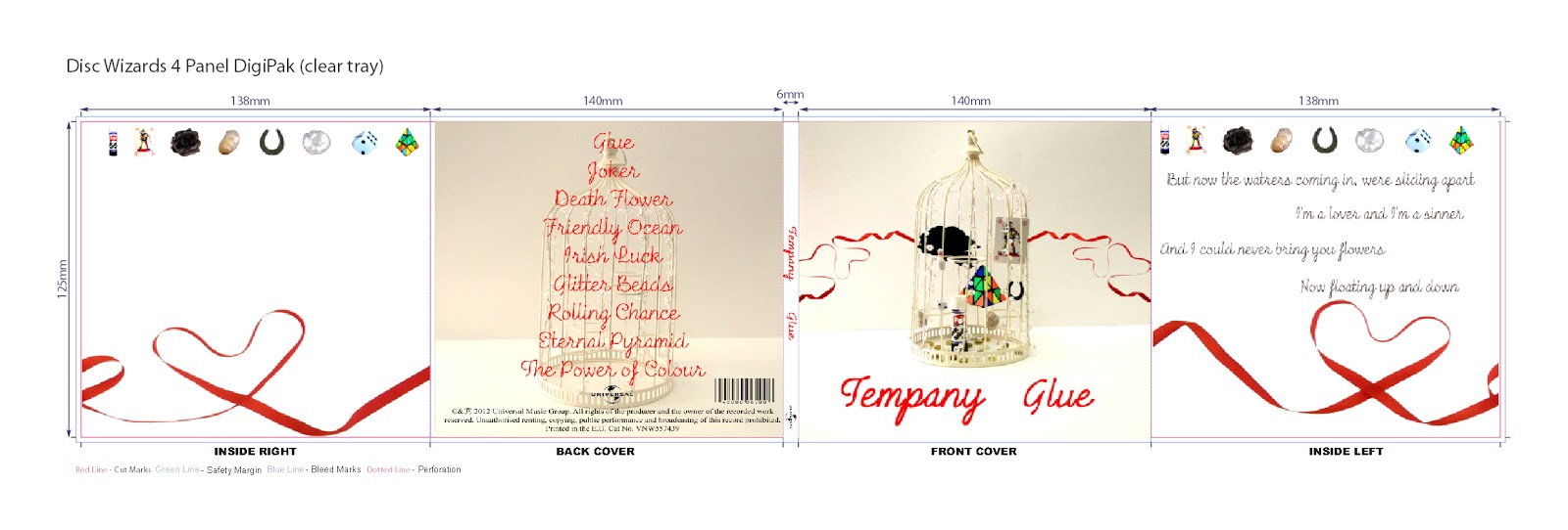
    All of the digipaks had a clear house style. For example, Coldplays digipak had the same style graffiti pattern running through the whole digipak and similar colours throughout reinforcing the house style. The clear house style on all the digipaks I have seen, from online to real life examples have a house style. This means my digipak needs to have a house style to fit in with generic conventions. A house style also attracts the audience to a digipak because it is a style they like and recognise. My house style needs to be attractive and appropriate for my audience to encourage them to buy the digipak.
  
    On the front of the digipak, the band/artist name and album name were featured. The style of the presentation of the band/artist name and album name varied widely from position to font style and colour because of the changing house styles from digipak to digipak.  Coldplays album subverted these conventions. Only the album name was featured on the front cover of the digipak. This may be because Coldplay are a very established band and they're album name is very unique so wouldn't be mixed up with another band's digipak. The font style and colour of the band/artist name and album name are repeated on the spine of the digipak to help enforce the house style. 

    On the spine and generally on the back of a digipak is a symbol representing what record label the band/artist is signed to. I have discovered this is a generic convention. Therefore, before I start making my digipak, I need to research different record labels and decide which one would be best for my artist so I can use their symbol on my digipak to make my work look as realistic and professional as possible. 

   On the back of the digipak, the tracks for the album are displayed which is a generic convention. The layout of these vary due to varying house styles. The tracks are always listed in the order they are played on the album. Therefore, I can experiment with the layout of my tracks and the font to keep with my house style, but my tracks need to be kept in order to fit with generic conventions.

    The CD is never just a CD I have found on the digipaks I have deconstructed. The CDs are part of the artwork of the digipak. They are decorated in a style which fits in and compliments the house style. This has shown me that I need to consider my CD design aswell as my digipak artwork to have a fully designed digipak.

    Before I started deconstructing digipaks, I thought that a generic convention would be that the band/artist would be featured on the front of the digipak. However, I have found that this is not always the case within the indie genre. Two of the digipaks I have constructed, Coldplay and Arctic Monkeys, had no images of members of the band on their digipaks. Other digipaks I have looked at in the indie genre also have a lack of images of the band/artist. This shows me that I do not have to follow the convention of having a image of a person on the front of my digipak to attract the indie target audience. After some more research, I found that in the pop genre there was a stronger generic convention of having images of the artist/band on the front of the digipak. This suggests that the importance of this convention varies from genre to genre.

    The album name normally is one of the songs on the album. For example, the Mumford and Sons digipak I deconstructed; Babel was the first track on the album. This suggests to me that my album name has to be on eof the songs on my album to keep to generic conventions. This could be Glue which is the song I have used for my music video, or it could be another song I would display on the track list at the back of my album.

All of these generic conventions I have found I will consider and use in my work to make my digipak look as realistic as possible so if it did enter the market it would sell well making my artisr successful.

I have also looked at different templates and layouts of digipaks. The digipaks I deconstructed all had a simple layout which folded out. This is why I decided to look at different layouts of digipaks. From researching these, It has given me many different ideas about what template I could use to make my digipak to make it unqiue and stand out in the busy music industry market. 


Wednesday 24 October 2012

Different Digipak Template Research

Digipak Designs

The digipaks I have deconstructed have a basic digipak design. You have a front which opens out to reveal a CD. From examples I have seen, there are many amazing, out of the ordinary designs ha a digipak exists.


This digipak belongs to the band "Foreinger" for the album 'Lowdown and Dirty'. At the time of release, the main method of playing music was to use a CD player. Therefore, they're digipak cleverly resembled a CD player that the audience would be able to recognise. The CD of the digipak is tucked away and protected by the CD player and case. The album name can be seen printed in a recognisable style of font where a real CD player would display the band/song name. The use of the music playing product to form a digipak makes it attractive to the target audience and makes it stand out against other digipaks or dualboxes.


This digipak is by "Zoviet-France" and the album is called "Just an Illusion". This digipak has the appearance of a sealed box.  When closed, the wooden box has a abstract pattern in a darker brown colour which almost looks like it has been wood burned. The Box opens up to reveal a paper case which has the CD inside. This wooden box completely protects the CD. It also makes the album feel special to the audience as they can lock it up and keep it safe.


This digipak for the album "Stress" by the band "Stress". This is a example of a ordinary digipak style. It has a front cover which folds out into several sections to reveal the CD at the centre. The centre of the digipak has several images of the band, all of which link to the house style.


This digipak is for the artist "Francesca Beghé" for the album called "Francesca Beghé". This is another example of a generic digipak. This one simply opens up to reveal a booklet and then the CD. A house style can clearly be seen in this digipak once again representing how important a house style is for a digipak.


 This digipak is for the band "Whitesnake" for their album called "Slip of the Tongue". The digipak itself has been wrapped up inside a layer of cardboard which appears to have been sealed by a ribbon. Inside this packaging is the actual digipak which has a large red wax seal placed in the centre. I like this idea of the digipak being wrapped up inside so it has the connotations of it being a present to the audience buying it.


This digipak by the band "Sting" for the album " The soul cages" is similar to "White Snake" album above. The CD has been wrapped up in a hessian digipak. This folds together and is wrapped up with hessian rope. The hessian has been decorated to create a house style, with calligraphy style writing printed onto the material. I like how the digipak  folds up to create a package which the audience can then unfold like it is a present to them. However, the hessian material the CD is wrapped in does not seem to provide much protection for the CD which could lead to it being broken.


This digipak is for the artist "Julia Fordham" for the album "Manhattan Skyline". It has a very classic house style. The digipack is fastened by a red ribbon which  runs through the digipak. The digipak opens out to reveal a flap in the centre which has a cut out skyline representing Manhattan. behind this is a red case which contains the CD. The red case helps to hightlight the cut out outline in the flap of the digipak making it stand out. The digipak has a clear house style using the colours red and white.


All of these different templates for digipaks I have viewed have given me many different ideas for what design I would like my digipak to be. It has also opened my eyes to how a digipak does not just have to be something that opens up but can be any design or shape.